top of page


Overview
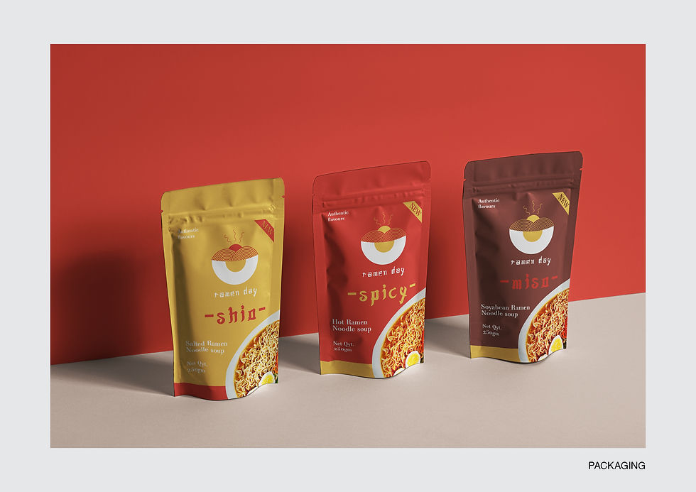
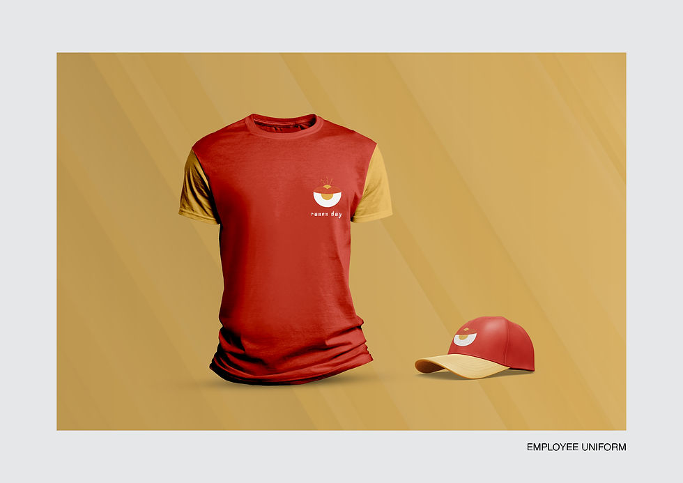
I created the hypothetical brand called “ramen day”, which is a restaurant based in Japan. Its speciality is ramen noodles, thus the name. The logo shows the elements of the typical ingredients in a bowl of ramen, like eggs and noodles. As the name has the word ‘day’ in it, the logo depicts the sunrise and valleys. The colour palette is kept minimum with 2-3 colours. (excluding the neutral shades) The font used mimics the Japanese typography. The patterns used in the branding goes with the logo as well as traditional Japanese motifs.
Ordering
App UI


Branding



bottom of page